If it's Labor Day it must be time for the annual Reggae Festival.
Hosted by local reggae band Seefari and MC'ed by music scene promoter/radio personality Rev Cool, it's on sunny and green Dave Hall Plaza, in the heart of downtown, on Sunday afternoon.
There will also be food, beverage, & merch vendors.
This is one of the best free events in the city, just a good pleasant vibe going on here. The lineup can be found at the festival website; as in past years a mix of local and touring acts.
Music starts at 1:00 PM, but get their early for a shade tree spot to spread your blanket or set up your lawn chairs
From Reggae Festival to Reggae Weekend.
The festival has started to expand. The Trolley Stop in the Oregon is having reggae all weekend, Friday and tonight (Jah Roots from Springfield MO is on tonight).
After the festival the following afterpartys:
Therapy Cafe: Good over Evil International Sound Consortium, hosted by Scorpius Max
J. Alan's: hosted by Groove Therapy with Special Massive and speical guests
South Park Tavern: Hosted by The Pocket (touring band from DC)($5 cover)
Found Art Show @ Front Street
Even though the Oregon + Cannery are the more visible and accessible gallery spaces, the old Front Street mills are still a home to lofts and one gallery. C2 seems to be keeping the alt/indy/DIY flame alive with various shows, though I don't keep up with their schedule.
Happened across this benefit flyer over at the always excellent Bhudda Den, and it looks interesting...a benefit for the Circus' Garden Station over at Wayne and 4th.
This time they have live music, too.
Tonight, starting @ 7:00 PM.
Saturday, August 30, 2008
Mapping Cultural Diversity in Dayton
The Asian Festival inspires this geographical look at cultural diversity and immigration in Dayton.
First this key map. Here I show some landmarks: rivers in blue, expressways (black lines), some surface streets (red lines), and various locations and landmarks. I recognize geography education is poor in the USA and people have trouble recognizing patterns on maps, so this is to help orient you, at least in a general sense.
I also include a part of Greene County here, but do not show county lines and city limits as I want to emphasis the Dayton metro area as a whole, as a system, getting away from a parochial POV.
I did have to sacrifice some coverage of both counties, but as you will see, for the purposes of this topic, we’ll still be able to capture the relevant geography.
In all the following maps I show only the higher concentrations. Asians, Latinos, and the foreign born are found throughout the area, but in lower numbers than I show here. Between 50% to 60% of the relevant populations are being mapped, the balance distributed throughout the two counties.
First, mapping Asians and Latinos by number (we saw the Asian map earlier).
The Asian population, which we’ve seen before, with substantial concentrations in Washington Township, the Springboro Pike corridor and the Beavercreek/Wright State areas.
There are about 8,909 Latinos in Greene and Montgomery counties who answered the census, which probably does not include the undocumented population. One can make a safe assumption that due to chain migration effects the undocumented will live in the same tracts as those who responded to the census.
One can see how the Asian and Latino geographies overlap in suburbia, but also how Latinos are starting to concentrate along the Mad River/Route 4 corridor into Greene County, with a substantial urban population in east Dayton, particularly in Twin Towers, Huffman, Findlay Avenue & Springfield Street neighborhoods.
There is also a concentration in military housing at Wright-Patterson AFB and in the Fairgrounds/University of Dayton area.
Next I combine Asian and Latino populations, and express this number as a % of census tract population, perhaps as an indication of cultural diversity, showing which tracts have a higher % of non-white/non-black population, and map out the results for the top tracts.
Using this method tracts with small overall populations but even a moderate number of Asians + Latinos will have having a higher %, and large numbers in populous tracts will be diluted and appear as a low %,
Here one can see the concentration in the Fairfield Commons area as the highest concentration by far at 11.33%, followed by a concentration in base housing, Wright State/Colonel Glenn corridor, and the Springboro Pike corridor south of the Dayton Mall. There is also a concentration in a tract in northern Huber Heights, off the map.
The only substantial city concentration is in Twin Towers, plus a lower concentration north of E 3rd, east of Findlay.
Immigration & Foreign Born
The above maps count Asians and Latinos, but make no distinction if they are immigrants or not. And not all immigrants are Asian or Latino. The census counts 18,905 foreign born individuals in Montgomery and Greene Counties, and they could come from a variety of places, including the traditional immigration source of Europe. The numbers here are small, as we shall see.
Mapping out the numbers, one sees similar distribution as for the Asian and Latinos, but also slight concentrations to the north (including some tracts off the map), and a concentration between Wolf Road and N Main Street. Wright State area is again a leading tract, perhaps indicating that WSU is attracting foreign students.
The Twin Towers/Linden Heights area is the concentration in inner Dayton.
Mapping the percentage of a tract that is foreign-born. Again the Fairfield Commons area is one of the top tracts, along with McPhersontown, which didn’t appear in any of the previous maps. Perhaps the foreign born population in McPhersontown is not necessarily Latino or Asian?
Wright State area and a newer suburban tract in Greene County also have higher percentages.
Suburbia does seem to be a popular location for both Asians and Latinos as well as the foreign-born population (recognizing there is some overlap). Newer suburbia and edge-city areas seem to particularly favored.
The exception is for Latinos, with East & North Dayton (particularly the Twin Towers ) and a corridor heading east/northeast into Greene County, having concentrations.
It’s also interesting to see Moraine pop up a few times on these maps.
Wednesday, August 27, 2008
Kentuckians: no longer poorly schooled?
Somewhat related to education, and ironic given Ohio stereotypes of Kentucky: Mean statewide SAT scores for college-bound seniors from both states have been released. Kentucky scores higher (source):
Kentucky:
Math, 570, up 5
Reading, 568, up1
Writing, 554, up 1
Ohio:
Math, 544, up 2
Reading, 534, down 2
Writing, 521, down 1
Ohio scores for reading and writing are dropping, too
So, though there still are a lot of ignernt Kentuckians, the college-bound ones seem to test better, at least the ones taking the SAT (most college bound Kentuckians going to the state system take the ACT).
A far cry from the days when Kentuckians used to say “Thank God for Misssissippi”, and apparently the state education standards that came out of the court-ordered education reform might have something to do with this:
The College Board, who run the SAT, has district and school data (so it is possible to district-to- district & school-to-school comparisons for the metro area), but these are only available to school district officials (not available to the general public)
State level reports are available, and can be found here.
Kentucky:
Math, 570, up 5
Reading, 568, up1
Writing, 554, up 1
Ohio:
Math, 544, up 2
Reading, 534, down 2
Writing, 521, down 1
Ohio scores for reading and writing are dropping, too
So, though there still are a lot of ignernt Kentuckians, the college-bound ones seem to test better, at least the ones taking the SAT (most college bound Kentuckians going to the state system take the ACT).
A far cry from the days when Kentuckians used to say “Thank God for Misssissippi”, and apparently the state education standards that came out of the court-ordered education reform might have something to do with this:
Meanwhile, Kentucky Education Department spokeswoman Lisa Gross said Kentucky has such a low percent of students who take the SAT (6 percent of public school students this year) that state educators don't try to draw many conclusions from the data.
"But, we do hear from higher ed sources that those kids who've done well in writing - or even had good writing instruction - in high school tend to perform at higher levels in college," Gross said.
"We know that college work requires complex levels of writing, so teachers often use the mandated writing portfolios to nurture those.."
The College Board, who run the SAT, has district and school data (so it is possible to district-to- district & school-to-school comparisons for the metro area), but these are only available to school district officials (not available to the general public)
State level reports are available, and can be found here.
Dayton Public Schools: Dead Last
The lowest scoring public school district in the state.
From Lake Erie to the Ohio River, from rural cornfields and Appalachian hollows to city streets and suburban cul-de-sacs, no community in the Buckeye State has worse public schools. So says the state test scores, according to the DDN education blog.
Not really my issue as I don’t have kids or live in Dayton. Yet it is my issue as I’m concerned about the physical survival of the city.
Such abysmal performance means the City of Dayton is out of consideration as a pace to live for families with school age children who care about their kid’s education, unless they want to incur the additional cost of private schools (or opt for home-schooling).
So you can imagine what this means for the housing market in the city. Bad schools probably contribute as much to vacancy and abandonment as the foreclosure crisis and generalized economic decline, because families avoid either buying or renting in the city. The end result is more demolitions and an increasingly empty Dayton.
One can point to Fort Recovery and Saint Henry up in Mercer County as examples of school districts with limited resources scoring high, as these are both in remote rural areas with little industry. I recall Fort Recovery has repeatedly scored high in the state ratings.
Then the argument is that these rural districts are not really comparable to Dayton due to size and cultural homogeneity. So I offer Cincinnati Public Schools as a counter-example, as an urban district that is improving, scoring the best of all urban districts in Ohio. There is a good thread on CPS at Urban Ohio, as well as a Cincy Enquirer article pointing out the success of the city high schools driving the rating. Follow the links to read about an academic success story.
Now yer humble host doesn’t know much about education, being a C student himself. But something has got to give with DPS if the city is to have an even chance.
Monday, August 25, 2008
Asian Festival + Asians in Dayton
Asian Cultural Festival last Saturday in Miamisburg, in the Library park.
There was supposed to be one last year, but it was cancelled. All the variou Asian groups in the community get together to throw this little festival (actually not so little, as they had quite a few booths set up).
The schedule had a lot of folkloric dancing, like this group, the Changkoo Dancers (Korean dancing) on a stage in front of the library....
And plenty of opportunity for shopping for various things, including some pretty good food booths. This and the other festivals are always good places to try something different for food (for example, the Vietnamese had their excellent iced coffee)...
More folkloric performance. This was actually pretty interesting; a Korean drumming group. The program says "Taiko Drumming"...
There was also a kids stage/storytelling area. This was a fairly low-key event, but actually could be something that develops over time.
There aren't many Asians in Dayton, 10,366 combined (2000 census 100% count). This translates to 2.0% of Greene Counties total population and 1.3% of Montgomery Counties. Greene has the highest % in SW Ohio, including metro Cincy. This may seem small, but it's enough to support little markets and restaurants and stores scattered throughout the area, as well as some churches and temples.
The Asians can be found all over, but the concentrations are in newer suburban areas, mostly along and outside of I-675.
The two concentrations, or census tracts with over 100 Asians, are on either end of I-675, in Washington Township/Dayton Mall/Springboro Pike area, and in the WSU/Fairfield Commons area. , with additional lesser concentrations in Beavercreek, Fairborn, Bellbrook, Springboro, and the Kitridge Road area, and an area in Huber Heights off the map (numbers from the 2000 census).
The census provides a little detail on where the Asians come from, as Asia is a pretty big place. For Montgomery & Greene County combined, here are the percentages:
It'll be interesting to see what the 2010 census tells us. Mid decade estimates have both counties' Asian population increasing, but census estimates are not that reliable, and have been challenged elsewhere.
It also would be interesting to combine Asian with Latino (the "Third Immigration"), and compare with foreign-born, to see if the suburban distribution pattern holds.
Sunday, August 24, 2008
The Monument: Good Urban Design
Following up on the Newcom Manor post, here is an aerial showing that building, Monument Avenue (Dayton’s 19th Century social row), and the Soldiers Monument, which is a Civil Ware memorial.
The Monument was erected in 1884, after a lengthy fundraising campaign, which included repeat performances of the “The Drummer Boy of Shiloh” at Turner Opera House (today’s Victoria).
Lichtenberger’s caption :
Excavation for the foundation of the Soldiers Monument at Main Street bridge began on September 19, 1883 and ended on November 22, 1883. Granite for the monument was quarried at Hollowell, Maine. The first carloads arrived on April 19, 1884. The statue of the Union soldier was cut out of white marble in Carrars (sic), Italy. It arrived in Dayton in June 1884. George W. Fair of Dayton was the model for the statue. On Wednesday, July 30, a G. A. R. parade was held. It was estimated that 10,000 persons were on the streets of Dayton that day. The monument was unveiled the next day, Thursday July 31st. It was 85 feet high with the statue accounting for 11 l/2 feet. This photograph, which was taken in 1889, also shows the old iron bridge and the Hose Company
George Fair was a Dayton bricklayer, living most of his life in the neighborhoods west of downtown, between downtown & the Great Miami (now the site of Sinclair and the county government buildings)
After the Monument was dedicated Water Street was renamed Monument Avenue.
With the advent of the automobile the Monument became a bottleneck (back when Main Street had a lot of traffic), so it was relocated in 1948, to a park area across the river.
(pix from Dayton, the Gem City). Good view of the Biltmore Hotel here, and traffic coming across the Main Street Bridge. The Monument was a gateway feature for downtown.
And there it stood, pretty much forgotten, until the late 1980s, when an urban design plan for downtown proposed the relocation back to Main Street, as part of a larger streetscape improvement for Main (more trees and benches and such). This time, the Monument was sited mid block between Monument Avenue and First Street.
The Monument was rededicated in 1991 at the new site, just a few yards from it’s original location.
The design was to site the Monument in a traffic island, necking down traffic to two lanes as it passed the Monument, but broadening again after passing the island. The design is actually a good traffic-calming feature, permitting people to cross to the island, between a row of bollards, where there is some seating and a small plaza south of the Monument.
The raised planting beds provides a sheltered space in the middle of Main, so as to admire the monument and look at the surrounding streetscape.
A view of the Monument and island, looking north. As part of the project the statue of Private Fair was found to be badly damaged by acid rain, and was remade as a bronze casting by a Cincinnati restoration firm
The bollards marking the break in the raised planting beds, and dip in the curb, inviting one to cross the street
The little plaza inside the island, with the planting bed edges developed as benches. This is a neat space, actually fairly sheltered from traffic and somewhat intimate in scale, yet in the very heart of the city.
At the end of the space is one of those pay-telescopes if one wants to look into the windows of the surrounding high-rises. A pretty good view south down main (and one of Dayton’s trolleybuses is visible; since they don’t make them in the US, RTA got new ones from Skoda in the Czech Republic).
An interesting feature is that the planting beds are broke here as well, but the low iron fence prevents walking across the sreet (and a good thing, too, as traffic would start to accelerate at this point due to lanes starting to widen and the venturi effect of the island)
Looking back one has a great view of the Monument, flanked by flagpoles and decorative light globes, reminiscent of City Beautiful era urban design. From further back on Main, the Monument terminates the northward vista up the street, creating a sort of quasi-baroque or neoclassical urban design concept (boulevard vista, termnatd by a monument or arch or public building).
And looking back across Main at the ground floor of the Biltmore., with the street trees and widened sidewalk. The street was slightly widened at the entrance to the Biltmore to permit passenger loading and unloading.
This is a deceptively simple design, but it is quite successful in creating a mix of monumentality and intimacy, as well as being quite successful as a traffic calming feature.
One of the better urban design features in a mostly utilitarian city, and an illustration on how small design moves can still be quality moves, and have a big impact on a cityscape.
Saturday, August 23, 2008
Old School Downtown Housing
The current push to think of downtown as a place to live usually involves loft or apartment conversions of old commerical structures of various sorts, or new townhouse construction.
Historically, though, downtown had a mix of single family homes, apartments or living rooms above stores (walk-ups), and, later in the 19th century, residential hotels and apartment houses. These were found usually on the edges of downtown, but also fairly close in, like the Arcade apartments, and these two buildings at the northeast corner of 3rd & Ludlow, on the current site of the DP&L building.
The building on the corner was the Atlas Hotel, and to the right was the Ratterman Apartments (with a retal arcade on the ground floor). The eastern facade of the Ratterman faced the old courthouse and jail, as well as a little lane, so, though a deep building, there was some natural light to the rooms.
And you have to like the facade articulation of both buildings, with the bay windows.
Another example is this building, from 1901, at the northeast corner of 5th and Wilkinson, more on the edge of downtown. A good example of adapting the Italian Renaissance palazzo form for an "elevator building", rusticated base, extruded piano nobile into a shaft, then topping off with a cornice and some top detailing. And more great bay windows.
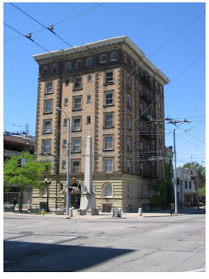
Yet another example is this elevator building, at the SW corner of Monument and Main, built sometime in the later 1890s (on the site of the relocated Newcom Tavern, the oldest structure in the city). The 1890s date marks this as one of the older high-rises in the Dayton.
Based on the verticle sign it was called the Harbor Hotel or Harbor Apartments at one time. And note the next door neighborhoods in this 1920s pix; a surviving single family home.
And it survives to this day, now named Newcom Manor. Interestingly, this is not the last of it's type as the Eva Feldman Apartments, from the 1960's, is typologically similar, though done up as modern architecture.
Newcom Manor, a builiding on west 3rd, and the Arcade are the last survivors of the prewar residential elevator buildings, though (and Newcom Manor is the oldest).
The exterior detailing is quite good. One can detect Sullivanesque touches in the arch decoration. Based on the detailing elsewhere on the facade (like the elaborate rustication, the stylized quoins, and exaggerated cornice) perhaps Mannerist palazzos, rather than early or high Renaissance, was the model (that massive cornice does bring to mind the Palazzo Faranese)
Yet this ground level detailing creates a rich and textured wall surface, adding visual interest at pedestrian scale, yet still transitioning the facade down to a solid-appearing base at street level.
The building has these half-basement spaces, with their own entrances. Based on the city directories these were retail spaces of various types, like coin dealers and cleaners and tailors. Nice little detail with that decorative wrought iron over the door, too.
The half-basement concept also raises the firs floor windows to just at or above eye-level, providing visual privacy for the interior.
Newcom Manor from the corner, with the fire escape on the side fcade. One can see the context -sensitive facade composition with the articulation of the fours corners via various moves, which activates the facade, remains true to symmetric compostion, but perhaps also references the corner site of the building.
To the side one can see some remnant housing along Monument Street, which brings to mind that, when built, this structure was in a residential area, and downtown expanded around it. Perhaps the scale of this building vis a vis its surroundings marks this as an early move in downtowns expansion north and west.
The obelisk is part of the urban design scheme from the early 1990s, which developed this block as a gateway feature to downtown, with the Monument as the centerpiece. This is one of the best urban design moves in Dayton, but not really recognized as such.
We'll take a look at the Monument ensemble next.
Tuesday, August 19, 2008
100 Years of Making Things in Dayton
The Dayton Daily News has a good pair of articles on the the 100th anniversary of Gerstner, the wood tool chest manufacturer (also includes a photo spread). The articles point out how the company managed to meet competition from Asia by opening a plant in China to make a lower cost line of chests, while maintaining their Datyon plant for their regular line (which costs more but is higher quality).
This company sounds a bit like a US version of a German Mittelstand firm, which are usually family-owned, and specialize in high quality products for a niche market. The concept was popularized in the US by business consultant Tom Peters, who blogged a bit on this last year.
Gerstner is a great example of how Dayton was (and still is) diversified in manfacturing, somthing that is obscured by the mass-employment auto sector. What's really remarkable too is that the company still keeps its plant in the city.
(Sanborn from 1950, showing the plant across the street from Aetna Paper, right on the levee. The Gersnter shop dates from 1913, though the company goes back to 1906).
This is nearly the last survivor from old West Dayton's industrial past, and the last factory along the river in this part of West Dayton. So a remarkable survivor, not just staying in business for 100 years, but remaining at the same location since 1913.
Sunday, August 17, 2008
A Historic Preservation Manifesto
The Sacramento History Blog isn’t updated too much, but it's a model of blogging on urban history. Last year there was this particularly good post:
Historic Architecture Liberation Front
(a repost from an American Bungalow magazine issue last year, from an article entitled “Confessions of a Radical Preservationists” by Jane Powell). It had this excellent preservationist manifesto:
1. All historic buildings are created equal, and endowed by their creators with the inalienable right to remain standing, be properly maintained and not be sacrificed on a whim, be that the whim of an individual, a government, an institution, or a corporation.
2. To paraphrase a Buddhist motto: No matter how innumerable historic buildings are, we vow to save them all.
3. Historic buildings should not be sacrificed in the name of "economic development," which is almost always code for "profit" or "power."
4. "Smart growth" that demolishes historic buildings and replaces them with inappropriately dense "infill" is not smart at all and will eventually be as discredited as the "urban renewal" of the 1960s.
5. There is no essential difference whatsoever between building more density in urban cores (at the expense of historic buildigns) and paving farmland. Both are driven solely by the pursuit of profit.
6. Historic buildings are not to blame for whatever social ills may be associated with them. The building did not choose to become a drug house or to have irresponsible owners.
7. 99% of contemporary architecture sucks.
8. There is no bigger scam than window replacement.
9. NIMBY really stands for Not Intimidated Much By Yelling.
The one I like the most is the one in bold. This is a Dayton issue.
People associate old city houses here, the old stores and shop buildings too, with social & economic ills, and don’t see them as part of the cultural patrimony of the community , or as elements of a larger urban fabric or environment that give a city its character. They are just junk to be torn down, because they aren’t ‘historic’.
Now I’m realistic enough to know that they are going to tear down a lot of Dayton, but I think attentions should be paid to these old buildings and neighborhoods before they die.
Attention must be paid.
Friday, August 15, 2008
Tech Town Tear Down?
In a recent DDN article on a fire at the old Delco Light, later Fridgidaire plant (AKA Harrison Radiator) some news about the fate of what might be the old loft buildings on site.
"The two buildings on fire are part of the city's Tech Town campus at 300 Taylor St. Both are scheduled for demolition. The buildings are 75 to 80 years old and have concrete walls and floors and wooden roofs."
Now it is unclear if this is the case (the two buildings in the story are #'s 10 and 13), but this was reported on earlier, and a topic of a Daytonology post: Tech Town Changes Plans.
But at that time it seemed up in the air. Now it seems a decision is made and Dayton will lose yet another piece of it's irreplaceable industrial heritage. Not that it's so impossible to do this kind of adaptive reuse, as its being done eleswhere
So the question is, if Tech Town is just another suburban buisness park, withoug anything distinctive (like a restored loft factory) what is the attraction? What makes it cool enough to attract advanced tech stuff? (And how cool would it be to locate on a floor in some funky lofty old industrial building?)
Why not just locate in the suburbs?
100 Freinds of Dayton?
Matt, host of Great n’ Dayton blog made a suggestion at DDM about restarting a community giving circle for Dayton, on a thread I parented on the Cleveland Collectivo.
The concept is philanthropy with punch
The Cleveland Collectivo is a way for people who are not activists per se to affect change by pooling dollars and making grants to activist groups and projects that have an urban or community emphasis.
In the fall of 2004 a small circle of people decided it was time to stop talking about Cleveland’s problems and start investing in solutions. They gathered together friends and neighbors to begin building a new giving circle and The Cleveland Colectivo was born. Inspired by the traditional practice of immigrant neighbors who invested in each other’s businesses in order to build community, the Cleveland Colectivo is a group of like-minded friends, neighbors, and colleagues who have joined together for the purpose of collective giving.
You can find examples of what they funded here
The way it works is the members buy in via $400, which gives them one vote. Folks (say friends, family, a group of co-workers, etc.) without $400 can pool resources to come up with the $400, and they collectively get a vote. So it’s sort of like buying lottery tickets for some big jackpot, except here you actually get a social or community payoff…different kind of jackpot. And, unlike lottery tickets, this is tax deductable, since it is a 501c3 nonprofit philanthropy
In the case of Dayton this would be a great way to affect change, to put your money where your mouth is. And it would be a legitimate way for suburbanites and the “Dayton Diaspora” contribute to positive change in the city, instead of bitching about city leadership (who they don’t vote for anyway) and how Dayton sucks, sucks, sucks. With this one supports action, not talk.
The only problem I see with this is that it was tried before.
A response at the DMM thread mentions “Dayton People's Fund”, which went defunct. So I wonder if this makes sense to do again. After hearing about the failed earlier attempt, my response at the thread was “why bother”.
Perhaps the failure of Dayton People's Fund was an example of Dayton region not having the capacity...people and money… to make things happen , though I don’t know the details of that effort (nor even heard of it).
Thursday, August 14, 2008
Louisville Cultural Revolution: Lessons for Dayton?
Though I’ve shown there is less money and people in Dayton, which may impair attempts to grow a scene here, the cultural or “values” factor should not be discounted. Perhaps this is the "secret ingredient" that has kicked off a cultural revolution in Louisville, a city that by all indications should not have much of an urban bohemia or arts scene.
A city that can be as gritty and low-down and good-old-boy as Dayton
Though there are more resources in Louisville than in Dayton, more people and money, there is still a choice involved.
People with money can choose. They can save it, invest it, or spend it on various things (or all three).
Apparently the choice in Louisville was to spend some of it. In some cases a lot of it.
On art. And music. And performance. And dining out.
And this probably is generating an emulation phenomenon, leading to more patronage, which starts to create a scene. Then there is Louisville-in-exile (including yer humble host). Expatriate Louisvillians actually tout the city rather than bash it, which generates a buzz, leading to non-Louisvillians to notice the place and write about it.
As an example of outsider buzz; Louisville Reframed, from an online magazine hosted by fashion house Ralph Lauren, What’s’ informative here are the quotes and observations from the art mob; their interpretation as to why a scene is developing:
"A sense of solidarity has developed among Louisville's arts community,” says Jay Jordan, director and curator of the New Center for Contemporary Art. “People here have something to prove, and there is a real interest in making Louisville a great place for artists to be.” It all started, he says, in the late 1990s, when several galleries popped up on Market Street and young artists began staging group shows in lofts and warehouses. Jordan also credits the city’s “really strong and serious” collectors of contemporary art. “They show a lot of support for and interest in regional artists, not just internationally renowned names,” he says.
"Louisville’s cultural renaissance isn’t confined to its arts scene. Beyond the city’s art patrons, a 30-ish group of movers and shakers is raising the area’s profile. They include Gill Holland, a film producer whose documentary Flow: For Love of Water, about the world’s dwindling water supplies, made a stir at this year’s Sundance Film Festival; Matthew Barzun, a media entrepreneur who is one of Barack Obama’s biggest financial backers; and Jonathan Blue, chairman of Blue Equity, whose holdings include a talent agency representing tennis ace Andy Roddick.
"The city’s dining scene is getting equally creative. Louisville boasts a number of notable restaurants making innovative use of local farms’ abundant bounty—a prime example being 610 Magnolia, whose six-course prix fixe dinners put a modern slant on Southern cuisine. They are the handiwork of chef Edward Lee, an ex-Manhattanite who chose Louisville for its proximity to farm-fresh goods. “Here I can just hop in a car and be at a farm in 20 minutes,” says Lee, who works directly with local growers to source ingredients. "
Craig Greenberg, a developer involved in the downtown revitalization and a partner in Museum Plaza, observes that Louisville “for its size, has a lot of young, energetic, civic-minded self-starters who want to take the ball and run with it and really make an impact. And in this town, that is possible.”
These are just anecdotes, But perhaps bolded points note what’s needed to make things happen; people with means who support local arts, a culture of patronage, a high energy level and bias toward action, undergirded by a certain broad-based civic pride (One thinks of the city states of the late Middle Ages and Renaissance)
Given Louisville’s relatively low ranking on Florida’s’ bohemian index it’s surprising this is happening at all for the visual arts, not to mention live original music, restaurants, nightlife and so forth.
Beyond what is happening in town, the Louisville diaspora evangelizes for the city, spreading the good news . An example of expat buzz is this piece from Big, Red and Shiny, a New England arts site by a former Louisvillian now based in Providence (a city that is also getting some buzz of it's own):
“On a recent visit I decided to take a look around and see what Louisville had to offer, not expecting much besides maybe some very nice quilts and paintings of horses - in the same way as expecting to find art galleries full of paintings of sailboats in New England towns.
What I found was a city reshaping itself around the arts…”
How did this develop? And how sustainable is this scene? Though the Ralph Lauren article says things started in the 1990s, the history goes back further, into the 1980s and even the 1970s. Exploring this back-story would be worth some future post.
Wednesday, August 13, 2008
Dayton's (and Louisville's) Questionable Bohemian Index
The local Creative Region Initiative has two projects focusing on the arts, particularly a film festival and a gallery/performance space. One of the Creative Region Initiative participants mentioned that, according to numbers provided by the Florida consultancy, Dayton ranks “above average” on the bohemian index.
The Bohemian Index
As a way of explanation this index as defined in a 2002 paper on Ontario cities, Competing for Creatvity, co-authored by Florida:
“Bohemian Index – The Bohemian Index is defined using employment in artistic and creative occupations. It is a location quotient that compares the region’s share of the nation’s bohemians to the region’s share of the nation’s population.
The paper also lists occupations used for the Bohemian Index:
Authors
Designers
Musicians and composers
Actors and directors
Craft-Artists, painters, sculptors and artist printmakers
Photographers
Dancers
Artists, performers, and related workers
I was thinking that Florida must be missing something. His book notes that Louisville ranked 30 out of 40 on this index for metros over 1,000, near the bottom. So if Dayton is “above average” it would presumably have a more visible and active scene than Louisville.
I don’t see that.
Then, looking again at Competing for Creativity, at the metro area list (which includes US cities). In this case Louisville and Dayton are compared together in the same size cohort, and actually are close using the Bohemian Index:
Dayton: 22,
Louisville: 20
This nearly equal ranking would also imply that the Dayton “bohemian” scene—artists, musicians, performers and related businesses and venues, would be equivalent to Louisville’s’ to some degree. Or Louisville would have as weak a scene as Dayton. This is not the case. Why?
(on edit Teresa Gaspar, active in the Creative Region Intiative, provided updated Bohemian Index numbers, based on 2006 data
Dayton: 1.o5
Louisville: -.87
..where 1.0 is the national average. In this case Dayton is above and Louisville below).
People and Money
I wondered if there is just not enough money in the local economy to support this. So I ran some numbers off the County Business Patterns database for both metro areas. CBP provides total number of workers, and total payroll (for the private sector), so it would be possible to see how much money was coming into the local economy, and a very rough measure of $$ per person. CBP would not pick up the military & civilian population associated with the Air Force, or their payroll.
Comparing the two metro areas, looking at number employed and annual payroll (both for the private sector only) for 2006, one can see that there are substantial deltas.
Assuming the core county would have the lion’s share of the patron and audience base for visual arts and performance, on can come up with notional income per person.
Interestingly, Dayton seems to do better in terms of annual income per employee (depending on how the aggregate payroll was actually distributed )
Swallows without a Spring
So what does this have to do with cultural creatives and Dayton’s relatively weak urban bohemia? It means that maybe the difference of $18.6 billion and 160,700 more people might be the difference between the land of the bland and some funky goings-on. The difference between more art galleries, music venues, an independent bookstore or two, indy restaurants, things like that.
The difference between, say, an Elbos or Night Owl or Rutledge Gallery or Santa Clara Arts District being economically viable or closing.
Perhaps the Louisville metro area has crossed some economic and population threshold to where it can support things Dayton can’t, even if the places appear equivalent on the Bohemian Index
So, for Dayton, a lot of swallows but no spring?
Tuesday, August 12, 2008
Eavesdropping at the Cocktail Party
....though its more like the cocktail party from Who's Afraid of Virginia Woolf.
That's what it feels like reading the recent thread at Esrati on The Foundry closing, which morphed into a discussion of the Creative Region Initiative. There is a related thread at Dayton Most Metro.
One is struck on how incestuous this all is. Though they argue, they mostly all know one another in person, they live in the same neighborhoods, and so forth. They name-drop the same names.
Yet, as was said by some of the posters, they are all playing on the same team, which is an interest in revival of the City of Dayton.
Thats all well and good, yet a narrow way to view urban studies or urban policy, especially considering how increasingly irrelevant the core city is to the economic and social life of the rest of the metropolitan area. It's city vs suburb all over again, just in reverse.
This limited city-focused perspective is particularly the case when discussing the Creative Class.
Last November I looked at the Creative Class, the geographic distribution of occupations associated with this concept, in Montgomery County.
Based on this one has to conclude that the Creative Class lives in suburbia. In fact a susbtantial amount may be living in Greene County, as the definition includes technical professionals, such as those associated with Wright-Patterson. Other observers have noted that Florida's broad concept might be excessively broad, and misses that locational preferences of, say, scientists and engineers, could be quite different from cultural creatives:
"Third, the location and community activities of artists (writers, musicians and visual and performing artists) differ markedly from those of other members of Florida's so-called creative class—accountants, lawyers, scientists, engineers, managers."
--Anne Markusen, in Artists as Community Developers.
So what might be attractive to technical proffessionals, with families, might be different from what's attractive to artists and performers. And should not the focus be on the techies and what they want and like, given the need to recruit for the growing military R&D presence here?
Perhaps the task is to improve the quality of life in suburbia and the small towns. Or at least forground these places as the true advantage of the area.
For the average defense technocrat and his family perhaps one should be selling Pleasantville, not Hipsterville.
Sunday, August 10, 2008
County Engineers and Bikeways.
Its been a month and yer humble host is finally getting around to posing on the bikeway issue.
Fort the Love of Dayton blogged on this back on July 10th, mostly reposting a DDN op-ed discussing the resistance of the county engineers to a complete streets proposal, where roads would have paved shoulders as bikepaths.
The engineers called this an "unfunded mandate".
One wonders if they oppose sidewalks, too.
This opposition is the usual "we've always done it this way" approach typical of bureuacracy. And it's misleading, too.
Areas that are suburbanizing will be seeing growing traffic, requiring realignment and widening of country roads. Sidewalks and bikepaths should be incorporated into road widening projects on arterial and collector roads.
This is different than adding new bikepaths to existing roads as stand-alone projects, which could be costly. By incorporating non-auto features into road widening plans one could realize economies of scale as contractors and subcontractos would be bidding on fairly large projects, with the bike lanes and sidewalks being a small component of the project cost.
Sure, cost per mile would be higher for a road project as there would be extra pavement involved. But this would just mean smaller projects, or projects phased over multilpe years.
The issue of demand is a classic circular argument, since no one will use bikes if bikepaths aren't built, but since no one is using bike the engineers can say the demand isn't there.
The way I see it the issue is one of choice. Failure to incorporate complete streets into regional transportion planning for suburban areas limits choice and becomes a self-fulfilling prophecy about bike use.
Thursday, August 7, 2008
Fastest Dying City Looking for Originals
Lots of fun online discussion about urban affairs this week.
Rumors of Dayton's Death Have Been Greatly Exaggerated
Investor magazine Forbes is notorious in the “urban geek” community for their off-the-wall lists generated by cranking in numbers and spitting out rankings or groups of cities.
This time they did a list of fastest dying cities in the US. Quelle surprise, Dayton was on it.
Forbes did note that they really meant fastest dying metropolitan areas, but that fact was lost on the posters at Dayton Daily News comments section (the DDN did an online article on it, and put columnist DL Stewarts tongue-in-cheek opinion piece on the Wednsday front page) , which quickly devolved into the usual whining about city problems and political axe-grinding.
One could probably gin up a little DDN comments generator since they are so predictable.
The DDMers had a lot to say, too, but more the other way.
Striking a balance, neoliberal urban policy expert (and local guy) Sam Staley had a more serious look at the local economic malaise over at New Geography. Staley provides a bit of history, notes that this metro area is more diversified than one thinks, and says , regarding economic decline, that this to will pass.(tip o’ the hat to Aaron at Urbanophile for turning me on to the Staley piece)
One has to wonder at the fortuitous timing of Staleys article, being online around the same time as the Forbes list.
If you want a peak at what Staley is talking about, but from yer humble host, check this recent blog post, where I come to similar conclusions with different numbers.
Originals Wanted
On a brighter note, Esrati opines that the new city brand has hit a home run, and I agree. Not much to add to his observations, but I will anyway.
Dayton Patented/Originals Wanted rings all the right changes on the various tropes of Dayton economic traditions without invoking yet again the tired mantra of the Wrights/Kettering/the pop-top, reflects what’s really happening here (assembly being replaced by tech, or parts to patents), and riffs on the “Keep Wherever Weird” meme by keeping “originals” open-ended enough to include cultural creatives.
I can see this on T shirts or stickys. On lamposts and bumpers.
Wednesday, August 6, 2008
Increase in Ambulatory Care Employment (1998-2006)
Ambulatory care means, I guess, medical care where you amble in: walk in and walk out. This is one of the largest subcategories in the "Health Care & Social Services" economic sector for Montgomery County.
This is pretty much doctor’s offices, medical labs and diagnostic centers, and outpatient clinics of various kinds. But it also includes home health care (which is a fairly large subcategory) and a collection of things like blood donor centers, ambulance services, and so forth, which I grouped as an “other” category.
The bulk of the employment here are in doctor’s offices, which includes ophthalmologists, dentists, chiropractors and such, followed by home health care. Outpatient clinics and the “other” category are a fairly low porportion.
Breaking out doctors offices , one can see how employment in this category is increasing at a good clip. This is probably one of the best subsectors for employment growth.
For the other subsectors, one can see an unusual dip for home health care and then a rapid rise. The other subsectors are relatively low employment, though at the end of the period they the Medical Labs & Diagnostic Centers reach 1,000 employees, with Outpatient Clincis not far behind.
Looking at trend lines, I start the home health care trend at the bottom of the dip, in 2002. This sector has a very high rate of growth, with the other subsectors less so.
Home health care might be expected to grow due to an aging and infirm population. But the big surprise is the increase in job growth in doctors offices. The data can separate out what kind of doctors offices, but not by the kind of worker. An assumption is that there are maybe more nurses and paraprofessionals working in offices now, not necessarily a big increase in the supply of MDs and other medical professionals (though there might be some if specialization is increasing).
(all the numbers are sourced from County Business Patterns and are for Montgomery County, including Dayton city).
Sunday, August 3, 2008
A First Look at Health Care Employment in Dayton
According to the County Business Patterns database the Health Care & Social Services sector is one of the few growing sectors in the Montgomery County economy, and has surpassed manufacturing as the largest employment sector.
Since this is becoming a signifigant part of the employment picture here, it warrants a closer look.
The sector really consists of two areas, the medical-related area of ambulatory care and medical/surgical hospitals, and the social services sector, which includes things nursing homes, day care, and so forth. All these sectors grew between 1998-2006, adding jobs over the time period:
Considered as a percentage or share, the medical side has by far the most jobs, around 70% of the category, much of that in hospitals:
Taking a closer look at trends, one can see how the two sectors segregate out.
Looking at growth trends, one can see ambulatory care increasing at a slightly higher rate:
For the nursing facilities and social services area the trend seems to be steeper:
What's interesting about these numbers is how they compare to manufacturing, in that some of these sectors employ more people than the entire local automotive sector, or the metalworking and machinery sectors. More people working in nursing homes than in the various fabricated metals companys here.
There's more detail in some of these categories (for example, ambulatory care). I'll look at this later in the week.