One should note this is called Fairborn-Wright because Fairborn had annexed south to take in WSU and the Colonel Glenn area, so what we are looking at is legally within the city of Fairborn. Beavercreek also annexed northward into this area, controlling the western reaches of Colonel Glenn.
Making Pancake Buildings Special
Typically spec offices are pretty banal. Boxes to house stuff. Lately we have been seeing them with really kitchy historical details. But in this case there is an attempt to "do something" with what ordinarily be either silly or dull, but doing it using a late modern aesthetic.
First off it's all done up in brick. And a certain type of brick (we'll see that later). There are minimal windows facing out, and it looks pretty blank and minimalist, like a lot of modern architecture.
Approaching the courtyard buildings, one can see how the designer varied the building perimeter, stepping the walls out so one enters the building, and the courtyard, by sliding between walls. Additional articulation is provided by the large wood fascias over the doorways.
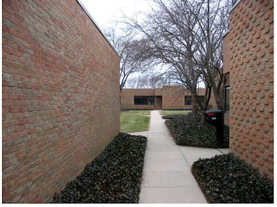
Another approach into the courtyard, which is gradually revealed. The brick here is not engineering brick, but a sort of used rough brick, giving a warm texture to the wall. The wall on the right uses decorative coursing, which one can see in the distance as well. Nice use of ground cover to add additional visual interest, with low trees creating a bit of intimacy at the entrance.
But that black plastic mailbox? Whatever.
The grand finale is the courtyard.
The buildings have big picture windows opening onto the space, and the walls with patterned coursing act as visual markers for entrances, which are always indirect. The step backs and facade composition activate the space, leading the eye to the gaps in the buildings, but the exterior parking lots are never visible. As noted before the landscaping also works to articulate entry points, with trees and ground cover at some of the entrances.
Unfortunatly that's as good as it gets. The additional buildings follow the same aesthetic of rough brick and sliding planes, but face parking lots instead of a courtyard.
Other Fairborn Wright Buildings.
The "twin towers". Perhaps also dating from the 1970s, this was the first of two three-story "spec boxes". The design is consistent with the pancake buildings as it uses brick, and the window treatment emphasises the verticle, which was the first and last time this was done on Colonel Glenn.. The twin is visible to the left in the background, behind the flag.
A later building from the early 1980s, perhaps. One sees a bit of the same aesthetic with the verticle windows, but also an angled atrium feature.
The last office building at Fairborn-Wright, dating from the mid 1980s. Now occupied by defense contractor Northrup-Grumman. The brick and horizontal band windows would be see further west on Colonel Glenn at Signal Hill and Ashford Center. And again the popular atrium feature at the entrance.
I don't know who developed these offices or the Fairborn-Wright office park. Whoever they were they did a good job with that courtyard ensemble.
Saturday, March 14, 2009
Fairborn-Wright Offices in Detail
Subscribe to:
Post Comments (Atom)

No comments:
Post a Comment